


 December 29th, 2009 -- Written by Rodney

In the coming weeks there will be a lot of improvements made to this page, and though slow coming I assure you its on its way.
Here is a little sneak peek at what’s coming
Yes, The Movie Blog community is coming back, as well as continuing the longest running Movie Podcast on the net. The podcasts have been sparse, but will return with a new interactive format.
Come along for the ride!
 Posted in
I always detest, hate and despise the “new looks” you guys do when you update the website. It makes me say a combination of:
“Ew!”
“Why!?” and
“NO!”
Equaling me in typing “Wtf!”
But after a week i end up digging it a lot and getting used to it. Im not a fickle person but still… i always like the old looks. And end up loving the new ones after detesting it.
=P
I hope it settles in well for you.
Its not a jarring change, but it is the first time I am designing the look of the site, so I am eager to get it implimented.
Oh no trust me, it will.
It doesnt matter how good it is, i always hate change. I hated this look at first, but after like 8 days i ended up forgetting about the change and noticing how much better it looked.
And yeah its not even that much of a change.
But remember that one time it changed from white and blue into that red “Screenrant” look?
I hated it, mostly because i hate screenrant, but yeah after 5 days i loved the little slideshow on top with the latest news thing /FILM also has (another blog i fucking hate, ugh)
But I like Peter (/Film) and Vic (Screenrant)
Don’t talk bad about our buddies! lol
Nonono Vic is beast, i like the guy
I dont know who peter is
The readers at those blogs are dicks. I have been deleted, banned, insulted and literally thrown out of a lot of asshole blogs (not /F or SR, im talking about multiple other blogs)
And in SR the readers HATE me
This is like the only site that never officially told me “get the fuck out”
Although sometimes i feel like its getting there
I dont have beef with the editors of /FILM or SR, its the readers.
Although the editors of some blogs have also been extremely unfair to me. Fucking dicks
@James: This is just a hunch, but calling them “fucking dicks” over and over again might not be the best way to endear yourself to them-they read this blog, too, you know…..
Again, just a thought :-)
The design seems fine to me.
Looking forward to more involvement from the community. :D
Looks good to me, very subtle difference. Some may not even notice. I have to admit that I’d be more upset if the site did a drastic color change. I identify this site with the crimson and and the colors are very somber to my eyes, just makes it easy to read.
To be honest, if a site has really bad colors I dont spend a whole lot of time there. The color scheme here is just one of the best I think.
Then you wont have any issues, as the colour scheme will be very similar.
I’ve been here for a while and the changes always freak me out for a grand total of two days before I don’t notice it. As long as everyone is still here, still talking about movies, I couldn’t care less about the colors:)
it’s the stuff between the pages that matter, not the cover, right? so long as it themovieblog, it will always be the same for me…
Hey Rodney…
Will you be continuing the commentaries that John, Doug, Bruxy and Darren started with the new TMB cast of characters?
Cheers.
Very likely a commentary could happen. If we feel so inspired by a film.
Some pretty great work there Rodney !
Cant wait to see the final result
looks the same. anyways hopefully you’ll guys will get good designers on this. i have to say, i always hate how bad the site looks. i mean it’s like something someone hand-coded and not powered by wordpress.
It is similar. The problem lies mostly with the current design and so many changes done over the last 6 years this site has been live. (Ive been here for all of it)
The coding is just such a mess that we are starting fresh. I wasn’t going extremely different with the design, so it will be a smooth transition. But it isnt the same.
critique from a designer: i don’t see how the new design improves upon the current one. pretty much the same. and the logo is quite a step back. the current lock-up of the type and simplicity of the film wheel is far more superior to using the film strips in the logotype.
And as a designer I can see your critique is simply opinion (fortunately we like those around here)
The logo is different - not a step forward or back. Just a different style.
It will be a subtle change, but there will be a change. The coding is changing, elements are changing and the design will be as clean and easy to read as before.
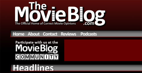
First of all, best of luck with the new site. I know how involved website redesigns can be, and there are always a number of challenges. I wanted to take the time to provide some (hopefully) constructive criticism on the new logo and visual design of the redesigned site.
LOGO
1. The ‘.com’ part of the logo looks awkward in the way it appears before the ‘g’ in blog. From a brand perspective, it would be better to drop the ‘.com’ since ‘The Movie Blog’ are separate words in your logo design anyway.
2. The use of filmstrips for the ‘i’ and ‘l’ make the letters recede. You used a nice typeface for the rest of the letters…there might be another solution.
3. The tagline ‘The Official Home of Correct Movie Opinions’ could use some whitespace.
USER INTERFACE
4. The use of white text on red/black/grey background colors throughout the site make it difficult for people to read who are visually impaired or are viewing the site on different devices. I always recommend black text on white background for everything, especially large chunks of text. Plus, massive areas of black and red can have a negative connotation to users.
5. The navigation bar seems really skinny. It would be great to have a larger button area for users to click on. This would improve accuracy for users and would provide some nice additional whitespace.
Without being able to see the rest of the design, I can’t comment on anything else. But you’re doing a great job, and I wish you the best of luck!
I think “Mike Mal” means it’s a step back, because of the predictability of using images of film as the “i” and the “l”. It would actually be witty if the word “film” was part of your name. But other wise there is now real reason to go in that direction.
Not to say that it was done bad though. The design was executed nicely. It shows that there was time invested in it, and attention to detail wasn’t overlooked.
I don’t know… I’m trying not to add my opinion.
i agree with david. but not just “.com”, the whole lock-up needs a lot of work. that’s why i said current logo’s lock-up is far superior. just on legibility alone it’s got miles ahead of the new one. and about the subtitle, it’s become so small that it seems like an afterthought. once you finished a logo at the desirable size, you should take a step back and see. sure this looks pretty comfortable at 1024×768, but hey, 57% of the interweb peepz use higher res than that. if a logo does not stand the test of size flexibility then it simply doesn’t work. that’s not a matter of opinion because you can have a beautiful logo that doesn’t work. you can continue to argue that it’s just a different approach, but you should know we are providing valuable feedback here.
And I appreciate the feedback. And just like the subjectivity of film, your opinion on the typography differs from my own.
I wanted a logo that was specifically different from the current one and I feel I have achieved that. The site is now in my hands, and I wanted the look to reflect my own personal style.
Yikes, I should have kept reading before I commented. There’s a lot of positive stuff here… You really don’t want any feedback do you?
Mike Mai is right about the Sub Head… and it’s an easy fix…
You know i was almost decided to leave the movie blog for good……but ive decided to stay. I want to give it a shot. I trust rodney
Thanks man!
i mean ive been coming dailey for 2 years now. and you have pretty much ran it for a long time. so whats really changing. no john, which saddens me but im sure your gonna do a great job
I actually prefer the new look of the site, seems like a change for the better if I’m being honest!
I applaud the quick turn-around and decision to keep The Movie Blog running and it’ll no doubt continue to be my first port of call for movie news.
@James: I know several /Film and SR readers (and an editor, who is a family member) that were reading The Movie Blog way before you slandered most posts with insults etc, yet you’re surprised why you get banished from most of them?
I’m sorry … but I find it slightly odd that TheMovieBlog still claims to have the longest running podcast … I don’t think that can be a valid claim anymore. Not to be a total dick here or anything. It’s just that they are so few and far between that I think it’s unfair to still try and make that claim. But … that’s just me. I am looking forward to it being back. I love podcasts and I can’t wait to have you (rodney) doing the casts … I think a fresh perspective and voice will be nice.
Remember the golden years of the site and podcast in 2006 with John and Doug? Those were the funniest, most entertaining shows back then!
Oh, and The Movie Blog’s listings on iTunes are a mess!
so when this new format goes up is that when we will be getting your Avatar Review? or has too much time passed for you to put one up…
maybe it can be a part of forgotten fridays?
The Avatar review kinda got yanked out from under me, and Christmas has kept me too busy to go see Alvin (kids keep begging) or Sherlock Holmes.
The site has an Avatar review. I would have rated it a tiny bit higher than John’s 8.5 by giving it a deserving 9. But for many of the reasons John did, I agree with.
I just didnt care that it was a Dances with Wolves ripoff in story. It was still a great story and fit well with the amazing effects.
cool cool, thanks for your thoughts.
yeah the whole saying its a “dances with wolves rip off” thing kinda bugs me. the whole torn between two worlds and choose the one you didnt originate from is an age old archetype that has been around way before dances with wolves. its just a classic story telling device.
Hey Rodney, nice new look, but any chance of you adding in the curtains in the background with that new logo? Just a suggestion…. Anyhoo…those are my 2 cents..:P
The curtains are just not happening.
lol thats cool.